P1: Media and Rep
Friday 4th November 2022
Media Language & Representation
L/O: to develop the language of media analysis

A1. An album cover.
Q2. What genre is this?
A2. Pop rock?
Q3. Who are the target audience?
A3.
Q4. How is the artist represented?
A4. The artist is represented as the focal point
Q5. What told me this?
A5.
Media Language
How the media through their forms, codes, conventions and techniques communicate meanings.
Genre conventions of camerawork, editing, sound & mise-en-scene:
- How are these elements used together to construct the media form so that it looks the way it does?
- How are these elements organised or combined in a certain in a certain way to communicate meaning in the set products?
- How does the genre develop through the use of technical elements?
- How does the content incorporate the viewpoints and ideology of the producer?
- How can multiple meanings be communicated and interpreted by the producer and audience?
Media Representations
How the media portray events, issues, individuals and social groups.
- Which different groups, individuals and/or events are presented or shown in each set product?
- What positive or negative stereotypes are evident and why?
- What messages and values are communicated about different groups of people, individuals and/or events?
- What conclusions can we make about these representations?
- Which groups are mis-represented or under-represented?
- How are representations constructed as real?
Media Contexts
The set products will be studied in relation to the three media contexts: political, social and cultural.
The contexts will need to be considered and demonstrate how the set products have been influenced by or developed in response to each context,

Album Cover Analysis


These two album covers have starkly different denotations, one is of a man holding a baby, while the other is a motorcycle with a woman's head. The first album cover connotes ideas of familial bonds and parenthood, though it is also a juxtaposition as the album features a parental advisory logo. It also connotes ideas of wealth through the watch he is wearing and the chain he's wearing, though the lack of colour means it is difficult to pick out the materials, this suggests that the wealth is not the main focus of the cover, it instead being the importance of family. The sophisticated font suggests that the album possesses an underlying message due to the serif font connoting ideas of importance and having something to say.
Wednesday 9th November 2022
L/O: to understand the terminology and theory needed to analyse music videos
Butch Cassidy & The Sundance Kid
Dirty single over the shoulder shot for a long time, creates tension as it obscures the face of one of the characters for a long time.
Close up shot of him staring at something to POV cowboy shot of holster, suggests that he's making sure he doesn't get shot. Focusing on his gun shows that the character is getting ready for a fight.
Silence of The Lambs
POV shot of main character
Lingering close up of serial killer to suggest him being intimidating
High angle OTS shot to show a power dynamic that favours the serial killer
The scene opens with a point of view shot from the perspective of our main character, Agent Starling, which tracks to reveal a long shot of the serial killer, Hannibal Lector, he is framed to be the centre of the scene and looks at the camera. This places the audience in the same position as Agent Starling, in front of a serial killer, making the scene far more uncomfortable.
The scene then continues, presenting a high angle OTS shot onto Agent Starling, it suggests Hannibal's superiority and power despite the fact that he is locked in a cell, it makes the scene even more uncomfortable, as the audience has already been placed in the same position as Starling once. This causes her to act as an audience surrogate for this scene, ensuring the audiences emotional attachment as it creates fears for Starling's safety.
James Bond

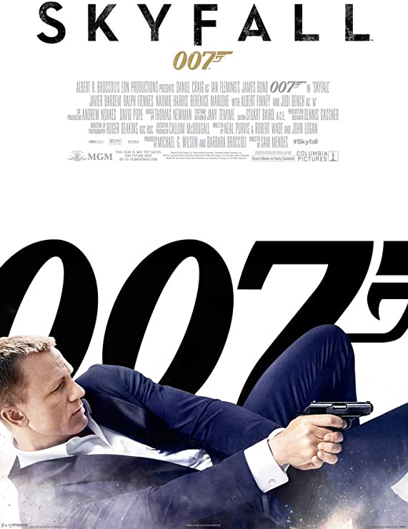

"The products constructed to market James Bond Films are designed to offer a clear appeal to a wide global audience of young males aged 17-35" Discuss
I agree that the products constructed to market James Bond films are designed to offer a clear appeal to a wide global audience of young males aged 17-35, with aspects of marketing material tweaked across the years to reflect the changing attitudes of the target audience as generations have gone by.
In the poster for 1962's Dr No, it reflects the patriarchal attitudes of the time through the risque and revealing depictions of women in contrast to the respectable and "cool" depiction of men. In the layout, James Bond is the largest aspect of the photograph, holding a gun and appearing in a suit, looking towards the audience, he is the focal point of the poster and the semiotic interpretation of his attire and the object he is holding could suggest that he is a spy, connoting ideas of mystery and espionage. These would have been especially topical in the 60s, as worries regarding the Cold War would become more and more prominent, so escapist media such as Dr No would allow both men and women to have their worries eased, though men especially would feel empowered by the depiction of bond as a respectable and capable gentleman who is able to save the world. This is in stark contrast to the representations of women. To start off with, the women are a more diminished aspect of the poster's design, connoting the idea that they are less important. Their attire is also far more revealing, suggesting sexual promiscuity and that their purpose in the movie is to act as sexual objects, this appeals to young men of the 60s especially as they had been raised to believe that they were more superior than women.
However, in the poster for 1983's Octopussy, there is a notable progression of attitudes and therefore a notable progression in marketing. In the poster, the female character is shown to have a more prominent role in the poster, standing behind Bond, closer to being his equal. However, she is still sexualised by the mise-en-scene, as she is seen to be wearing scandalous clothing which suggests promiscuity, which appeals to the target demographic of young males. Bond is also seen to be in his typical attire, suggesting that he is still the sophisticated spy role model for young men.
Finally, in the poster for 2012's Skyfall, there is a complete absence of women, the only representation is of James Bond himself, he is in a combat position, clearly in the middle of a fight.
Wednesday 16th November 2022
One Day By Lovejoy Analysis
The video opens with diegetic sound, as the lead singer climbs out of a window of what appears to be a friendly gathering to have a smoke, the camera focuses on his face while the video itself appears to filmed in a small aspect ratio, this means shots are claustrophobic and do not show the main character in full whatsoever. This could match the lyrics of the song, which describe the character eventually focusing on the future rather than being trapped in the past. The editing plays a part in matching the lyrics as well, with inconsistent cuts to different shots throughout the song matching the lyric 'isn't life so f****** inconsistent'. There is an absurdist element to the video, as towards the beginning there is a lone man on a bus with a bass guitar, who then gets off and stares at the lead singer, the man with the bass guitar starts playing which then leads the lead singer to sing. The lead singer points the bassist out to the camera, suggesting that at points the camera is a stand in for a person, creating a level of intimacy with the artist. There is a set of recurring clips during the chorus, in which the guitarist appears to being beaten up, it repeats the narrative idea of being trapped in the past and represents both the guitarist and lead singer as trapped. The representation of the attackers is that they are in winter coats, jeans and trainers, and they are attacking him simply because he bumped into them. This could act as a criticism of British night life, suggesting that it is dangerous and unruly.
Chosen Set Texts
Burn The Witch by Radiohead
Heaven by Emeli Sande
Burn The Witch by Radiohead
Stay in the shadowsCheer at the gallowsThis is a round up
This is a low flying panic attackSing a song on the jukebox that goes
Burn the witchBurn the witchWe know where you live
Red crosses on wooden doorsAnd if you float you burnLoose talk around tablesAbandon all reasonAvoid all eye contactDo not reactShoot the messengers
This is a low flying panic attackSing the song of sixpence that goes
Burn the witchBurn the witchWe know where you liveWe know where you live
Genre: Alt Rock
Lyrical Meaning:
What happens: Man is led through village of strange stuff, he is then led to his seeming death in a structure where he is burnt, the structure looks like a man. He is then shown with soot on his face before leaving. The video bookends with a blue bird.How does it link to lyrics?: He burns. Also small village is where most witches were accused in the 16th and 17th centuries
How is artist represented?: They aren't.
Heaven by Emeli Sande
Will you recognize meIn those flashing lights?I try to keep my heart beatBut I can't get it right
Will you recognize meWhen I'm lying on my back?Somethings gone inside meAnd I can't get it back
Oh heaven, oh heavenI wake with good intentionsBut the day, it always lasts too longThen I'm goneOh heaven, oh heavenI wake with good intentionsBut the day, it always lasts too long
Then I'm goneThen I'm goneThen I'm goneThen I'm gone
Then I'm goneThen I'm goneThen I'm goneThen I'm gone
Will you recognize meWhen I'm stealing from a carYou're not gonna like meI'm nothing like before
Will you recognize meWhen I lose another friendWill you learn to leave meOr give me one more try again
Oh heaven, oh heavenI wake with good intentionsBut the day, it always lasts too longThen I'm goneOh heaven, oh heavenI wake with good intentionsBut the day, it always lasts too long
Then I'm goneThen I'm goneThen I'm goneThen I'm gone
Then I'm goneThen I'm goneThen I'm goneThen I'm gone
Oh heaven, oh heavenI wait with good intentions
Oh heaven, oh heavenI wait with good intentions
Oh heaven, oh heavenI wait with good intentions
You say that you're awayI try but always break'Cause the day always lasts too long
Then I'm goneThen I'm goneThen I'm goneThen I'm gone
Then I'm goneThen I'm goneThen I'm gone
Then I'm goneThen I'm goneThen I'm goneThen I'm gone
Then I'm goneThen I'm goneThen I'm goneThen I'm gone
Genre: Soul/Urban Dance
What happens:
Heaven Codes and Conventions

Wednesday 30th November 2022
Heaven
L/O: to explore the conventions, contexts and representations in Heaven

Emeli Sande
Heaven was her debut single, 23 million YouTube views. Performance based music video promoting debut single (Image of her crucial). Signed to Virgin (Universal Music - One of the big Three)
The album, Our Version of Events was critically and commercially successful (best selling UK album, 2012)
One year after Heaven she had become an established, even iconic artist (sang at opening and closing ceremony of the London 2012 Olympics and sang in the White House) = rapid rise to fame.
How is she represented in the Heaven music video?
She's represented as feminine but not traditionally feminine, outfit is feminine rather than masculine, she's still wearing make up.
Where was it filmed and who directed it?
Filmed in Bethnal Green, London, United Kingdom and Directed by Jake Nava
How was it released?
It was first released on Sande's YouTube account which was fairly odd for a mainstream music video at the time.
Quotes or press releases
Sande
Emeli Sande is represented as religious throughout the music video of Heaven, this is constructed via the mise-en-scene of her costume. She is shown to be wearing a dress akinned to priest attire and as such it connotes the idea that she is a religious woman, and that perhaps the song acts as a sermon. Her body language when she moves her arms mimics preaching, which also connotes ideas of a sermon. It could also act as a cry for help from the heavens as she is seen to be singing to the sky throughout the music video from a lower angle to show the sky. Sande is also constructed in a juxtaposing way to artists of her age group, as rather than being sexualised she is shown to be wearing the more modest clothing and she is made to look older within the video.
How has Street Life been represented in 'Heaven'?
Street life in Heaven is represented as both positive and negative throughout the video. A positive representation of street life is shown in the scene where the sun is shining down on someone who is walking, which gives positive connotations of light and hope, showing that even in darkness (the person's silouhette) there is light (the sun). It creates a positive representation of the street life this person lives. Positive representations
However, an example of negative street life is the multiple shots of lighters and people smoking, this mise-en-scene has highly negative connotations of drug abuse and as such create the impression that people who live in a street life culture abuse drugs and alcohol. The 'heavenly' feel of the video creates the impression that these acts are being judged, connoting ideas of sin and temptation further reinforcing the idea that street life is a negative influence on the sanctity of one's soul.
Wednesday 7th December 2022
L/O: to explore the use of media language & intertextuality in case study videos
Where was it filmed and who directed it? Virpi Kattu was the lead animator.
What is the message/meaning of the video? The video critiques those who stand by traditional british values as well as 'look for someone to blame', 'refugee crisis'
What was happening in Britain during 2015/16? The video was released on the 3rd May 2016, shortly before the EU Referendum in the UK
How does the media language connote the theme of persecution?:
How is MES used to establish ideas of 'normality' and tradition?:
Red royal mail post box, man painting it has red paint on him, paralleling blood
Red X on the door connotes marking of plague victims, suggests something wrong with resident.
Red royal mail post box, man painting it has red paint on him, paralleling blood
Red X on the door connotes marking of plague victims, suggests something wrong with resident.
"The Speared Boar" is a mockery of traditional British pub names
How is rural life depicted?:
Idyllic, sinister underneath, traditions are barbaric, rural life doesn't respect social norms (farmer day drinking moonshine)
Intertextuality
The intertextual references help communicate the social and political issues are touched on in the lyrics.
Texts:
Trumpton and Camberwick Green TV series
The Wicker Man
News reports of immigrant farm workers
Nazi propaganda films
Trumpton and Camberwick Green TV series
The Wicker Man
News reports of immigrant farm workers
Nazi propaganda films
Trumpton and Camberwick Green
Camberwick Green was a stop motion children's television series that originally aired from January to March 1966 on BBC One. The series was set in a small, picturesque village of Camberwick Green, Trumptonshire. It was then followed by 2 shows in the "Trumptonshire trilogy": Trumpton and Chigley.
Trumpton was aired from January to March 1967, with Chigley airing from October to December 1969.
Burn the Witch mimics the style these shows utilised in it's music video.
Shows represented the way of life in idyllic little communities, and teaching children about community values.
The Wicker Man
The Wicker Man is British folk horror movie that released in 1973. The plot regarded Police Sergeant Neil Howie journeying by seaplane to the remote Hebridean island Summerisle to find a missing girl named Rowan. Summerisle is a pagan island, and it's residents attempt to prevent Howie from finding the missing girl. Investigations lead to Howie believing they intend to sacrifice Rowan to save the harvest. Lord Summerisle tells Howie that Rowan was never the intended sacrifice, Howie was. He fits the four requirements of their gods: He came of his own free will, has the 'power of a king' (represents the Law, is a virgin and is a 'fool'. The villagers then force Howie inside a giant Wicker Man along with various animals, set it ablaze and surrround it singing a Middle English song. Inside the Wicker Man, Howie recites Psalm 23 and prays to God before cursing the islanders as he burns to death. The head of the Wicker Man collapses in flames, revealing the setting sun.
The inspector within the music video is implied to be an authority figure, and also arrived at the town fitting 2 of the 'Gods' Criteria', he is shown around the town and it's culture before he is told to go into the Wicker Man, he climbs up and the Wicker Man is set aflame. Comparisons of current xenophobia to barbaric paganism. Juxtaposes the quaint rural connotations of Trumpton/Camberwick with the sinister undertones of the pagan rituals and The Wicker Man.
Explain how and why Burn The Witch uses intertextuality effectively
Denotations and Connotations


Mise-en-scene
Red cross on the door, connotes plague victims who were isolated from society entirely by the red cross and left to die.
Editing
Narrative

 This advert utilises a red tinted colour palette, which has connotations of love/seduction, this is further reinforced by the perfume's name "Hypnotic Poison", which suggests that the perfume helps the user to become more attractive, encouraging them to buy the product. She is looking directly at the camera, which suggests that she is powerful as she makes eye contact with potential viewers of the advert.


 The Old Spice 'Smell Like A Man' campaign from 2010 was a transformative mass market campaign for the aftershave brand. Prior to 2010 The Old Spice Brand was associated with a much older, more mature male audience. This campaign that sought to reposition the brand and make it more accessible to younger audiences. The campaign features the American Actor and Sports Star Isiah Mustafa. This poster was part of a follow up campaign in 2011 which sought to build on the success of the original campaign.
Lucozade

Rebranding
Rebranding is a massive challenge for a brand. Uniqueness is key, particularly industries where the amount of competition is intense. Modern research shows that brands must connect emotionally with their target audience if they're to stand out.
Isaiah Mustafa's body is depicted as the island, constructing the mise-en-scene as absurdist but fun for a younger audience. This is reinforced by the display of palm trees that are also on the product, it connotes the idea that the product has the scent of the island depicted on Isaiah's body. The lexis "This fact has not been fact checked" acts as a self-observation which makes the brand seem self-aware of errors and makes them appeal more to a younger audience. The volcano depicted on his head connotes the idea that the island is hot as he is literally exploding from his head with heat, it could also link with the featured lexis "This fact has not been fact checked", as there are no volcanoes in the Bahamas, the place the scent is based off. The holidaying activities depicted on the island such as sunbathing, fishing and water sports make the product seem fun and refreshing, alongside a bright colour palette which works with the visuals to ensure that the brand seems vibrant and fun for a younger generation.
Masculinity
L/O: to explore the changing representations of masculinity in the media and apply them to our case study


Traditional Representations of Masculinity -1970s/80s
Music Videos: Ideologies
Hedonism - The pursuit of pleasure and sensual self-indulgence
Emile Sande Ideologies
Hedonism - Suggested that she is searching for happiness
Feminism - Female empowerment, video is centred on her
Individualism - Emphasis is on individual lives rather than the collective
Individualism - Emphasis is on individual lives rather than the collective
Radiohead Ideologies
Nationalism - Shows English tradition and rituals and criticises them
Xenophobia - Fear of the outsider, attempt on his life, portrayed as negative
Individualism - Acts independently of village
Globalisation -
Authoritarianism -
How does narrative link to ideology?
The disruption in Burn the Witch is that something seems off with the town, standard English traditions are combined with the idea of barbaric pagan traditions, the producer suggests that English traditions, attitudes and values are barbaric and wrong. It criticises nationalism, xenophobia and authoritarianism.
The New Equilibrium sees the protagonist escape from the wickerman and wipe soot off his face, it suggests that the producer does see hope that these negative ideologies can change.
Homework
How is intertextuality used to construct meaning in one of the music videos you have studied?
In Burn the Witch, intertextuality is woven into the video in order to highlight the ideologies that the artist deems wrong. An example of this is the depiction of a pagan sword dance early in the video, this is a reference to a similar scene in the Wicker Man, it isolates the protagonist of Burn the Witch as he is the outsider and doesn't understand the village's traditions. This is further supported by a reference to the titular Wicker Man at the end of the video, where the protagonist is encouraged to climb into a large wooden statue and is literally "burned at the stake". This is a criticism of the Xenophobia exhibited towards migrant farm workers in 2015 and 2016 before the song released, and reflects the artists wish for multiculturalism.
Furthermore, intertextuality is also utilised through the use of Camberwick Green's animation style, this animation style is used to critique children's media which still reinforce ideas of "Us and Them" ideology regarding those who do not pertain to traditional British values. The style also juxtaposes the unnerving content of the video, with blood bleeding from a pasty depicted to be similar to the red paint used to decorate a post box and red crosses on the door of a local home, treating them like plague victims.
Wednesday 11th January 2023
Advertising
L/O: to understand the purpose of advertising and the language used to analyse texts

AIDA
Advertisers traditionally used this approach to hook audience's attention in advertising:
ATTENTION
INTEREST
DESIRE
ACTION
ATTENTION
INTEREST
DESIRE
ACTION


Centres on a man with a clicker, the clicker links to the lexis of "CLICK: The New Fragrance"
Colour palette is Coke's iconic red and white, constructs brand recognition before the person viewing it even realises it's Coke. Lexis "They don't make em like they used to. We do." creates the impression that the corporation is a real person that you can trust. Uses celebrity endorsement as the silouhetted figure is designed to look like Elvis Presley, appeals to older audience who remembers him.
Colour palette is Coke's iconic red and white, constructs brand recognition before the person viewing it even realises it's Coke. Lexis "They don't make em like they used to. We do." creates the impression that the corporation is a real person that you can trust. Uses celebrity endorsement as the silouhetted figure is designed to look like Elvis Presley, appeals to older audience who remembers him.

Lexis "Together we can end domestic violence and sexual assault" places responsibility on the person who sees the advertisement as it suggests one of the only ways to stop it is if people stand together. Celebrity Endorsement is involved as high profile actor Andy Serkis is featured, he acts as an ambassador for the cause, and his endorsement may make people respect the cause more.
Representation
L/O: to explore how representations are constructed in advertising
CAGEDS
Class
Age
Age
Gender
Ethnicity
Disability
Sexuality
Disability
Sexuality
Wednesday 18th January 2023

Exam Set Texts
Old Spice
Old Spice
Old Spice is a men's grooming brand.
Before they rebranded they appealed to an older and more traditional male audience.
Before they rebranded they appealed to an older and more traditional male audience.
Lucozade
The Lucozade 'I believe' Campaign poster from 2013 was part of a £4 million mass market campaign to educate consumers about how the soft drink brand can help improve people's sports performance. It features a range of sports personalities, including footballer Gareth Bale as a key brand ambassador. The campaign aimed to bring to life the claim that 'It hydrates better than water'. The brand wanted to reinforce how they were combining scientific expertise with product innovation.
Shelter
 Shelter, the UK-based housing and homelessness charity launched 'a home for everyone' campaign in 2011. As a non-commercial product, it encouraged donations to charity rather than a purchase of a product. It was produced for those at risk of homelessness to point them to shelter's free services and guide them to seek advice on issues around homelessness earlier.
Old Spice Campaign Analysis
The ad is part of a follow up to the 2010 "Smell Like A Man" Campaign, this campaign was used to promote the Old Spice Fresh Collection, and the print campaign was meant to represent the paradises that the scents were inspired by.
The ad is part of a follow up to the 2010 "Smell Like A Man" Campaign, this campaign was used to promote the Old Spice Fresh Collection, and the print campaign was meant to represent the paradises that the scents were inspired by.
1960s Men's Grooming Ads
Sixties male grooming advertising consisted of two elements: 1. Manly superstuds, the hairier the better and/or 2. The women who can't resist them. The brand Musk is literally represented as a pheromone, propelling women to involuntarily throw themselves at the male wearer. The promise: A lifetime of easy promiscuity
Sixties male grooming advertising consisted of two elements: 1. Manly superstuds, the hairier the better and/or 2. The women who can't resist them. The brand Musk is literally represented as a pheromone, propelling women to involuntarily throw themselves at the male wearer. The promise: A lifetime of easy promiscuity
Rebranding
Rebranding is a massive challenge for a brand. Uniqueness is key, particularly industries where the amount of competition is intense. Modern research shows that brands must connect emotionally with their target audience if they're to stand out.
In 2010 Old Spice introduced a campaign seeking a fresh brand image after decades of simply implementing the same message. The result was one of the most successful campaigns in advertising history as an example of how a 75 year old brand was able to reinvent and sustain itself via the use of a range of promotional media - TV, print, online, social media.
For us, the focus is on the meaning/response of the OCR set product - the 'Fresh Places' campaign of 2011. OCR are clear that we must also consider how it represents the contexts of this era. To do so we need to be aware of the nature of branding and of the shift in the social and cultural contexts that shape the OCR product.
Old Spice Rebrand
Old Spice rebranded from a more traditional men's grooming product to a product which appeals to young men and their girlfriends through the use of celebrity endorsement and absurdist humour. The brand is also self-critical in their new campaigns which creates the impression of self-awareness which appears to the more modern and critical consumer base of the digital age.
Isaiah Mustafa's body is depicted as the island, constructing the mise-en-scene as absurdist but fun for a younger audience. This is reinforced by the display of palm trees that are also on the product, it connotes the idea that the product has the scent of the island depicted on Isaiah's body. The lexis "This fact has not been fact checked" acts as a self-observation which makes the brand seem self-aware of errors and makes them appeal more to a younger audience. The volcano depicted on his head connotes the idea that the island is hot as he is literally exploding from his head with heat, it could also link with the featured lexis "This fact has not been fact checked", as there are no volcanoes in the Bahamas, the place the scent is based off. The holidaying activities depicted on the island such as sunbathing, fishing and water sports make the product seem fun and refreshing, alongside a bright colour palette which works with the visuals to ensure that the brand seems vibrant and fun for a younger generation.
Masculinity
L/O: to explore the changing representations of masculinity in the media and apply them to our case study


Heroic, Strong, Eloquent, Witty, Humorous, Confident, Well-Groomed, Long Hair
Does the Old Spice Campaign adhere to modern stereotypes? Who is the target audience?
The target audience is young men and their girlfriends. I do not think that it adheres to the modern stereotypes of masculinity as it portrays it in a hyperrealistic form which does not reflect reality and acts more as a parody.
The target audience is young men and their girlfriends. I do not think that it adheres to the modern stereotypes of masculinity as it portrays it in a hyperrealistic form which does not reflect reality and acts more as a parody.
Analysis and Context: Lucozade
L/O: To analyse context, codes and conventions in the Lucozade advert
History
Gone from linking themselves to aiding recovery of sickness in the 50s to acting as a brand that is a "sports ambassador" today.
Lucozade
Utilisation of celebrity endorsement of Gareth Bale, a very skilled footballer who is focused on sports for his job. This means he has good authority and reason to use a product such as Lucozade Sport. The lexis "In a different league" is featured utilising block capital and sans serif typography in order to connote masculinity, while the lexis itself connotes the idea that the product is of a far higher quality than other energy drinks, and as such encourages the use of it.
Bale's expression in the advert further reinforces this idea of quality, as his steadfast expression connotes the idea that he is focused on his athletics and that if the audience uses the product they will have the focus and drive that he does.
The desaturated colour palette and the celebrity's face coincide with the lexis 'scientifically' proven, as both connote very clinical settings of precision and perfection and create the idea that the brand is based on science dedicated to health rather than just focusing on an energy boost. The colour palette also strays from traditional energy drink advertising which often utilises neon colours, which creates a distinct identity for the brand free of the negative connotations given to traditional energy drink options such as "Monster".
Shelter Ad Campaign
L/O: To analyse Context and Codes and Conventions in the Shelter Advert
Charity campaigns try to empower the audience into helping those less fortunate than them.
In recent years desensitisation to content seen in charity adverts has led to people who see these ads being less likely to support.
The SHELTER advertising campaign was aimed at those who were unaware of the support available to them if they were at risk of homelessness.
Commercial adverts are used to sell a product, where as charity adverts are used to raise awareness of the services a charity can provide as well as raising awareness to get donations. Charity adverts will often utilise direct address more, as it places responsibility on the viewer of the advertisement and empowers them to help with the cause.
Social and Cultural Context 2011
VAT increased 20% from 17.5%
Lots of strikes across the year over pay
36% of people rented the house they lived in, with home ownership falling for the first time since 1918, falling from 69% in 2001 to 64% in 2011.
People were earning on average £28,000 pounds a year in 2011.
SHELTER AD ANALYSIS
Direct address within this campaign is used to tell those in need that they're not alone and SHELTER can help them. Drab colour palette represents the serious nature of the advert, grounds it in reality. Serious expressions of sadness connote the suffering that these people feel and as such attempts to make the audience sympathise with the people who suffer from this very real issue. The red connotes the idea of danger and urgency, as well as also representing the red found on eviction notice/late payment letters that would associate with the aim of the charity to prevent homelessness. The donation text is the smallest part of the advert and is under the rest of the advert which shows the priority of the advertisement is awareness of the support available. The search bar along with the lexis "Search Shelter Housing Advice Now" is a call to action for people to get help with their housing issues.
It attempts to represent that the suffering should not be in silence as it uses direct address to talk about how they can help. It attempts to decrease the stigma and shame around money/housing issues in order to help people keep their homes regardless of their situations. The representation of suffering is increased through the representation of exhaustion through the "bags" under the people's eyes, as it suggests that worries have caused anxiety and therefore trouble sleeping. The people on the poster are also represented as older than they are due to the colour palette.
The ad campaign's view is that everyone should be able to live in a home without threat of being evicted/having the property claimed by a bank. The campaign also imbues a sense of social duty in the audience as it reveals the social inequality of society and encourages the person viewing to help someone who is less fortunate than they are.
Exam Style Questions
L/O: To analyse representation & media language in similar adverts
Paper 1:
Q5 is usually a 10 marker, often on music videos or advertising
Q6 is a 15 mark question, either Big Issue or advert comparison
Question 5 Practise
"Explain how representations in music videos are chosen to promote the artist(s)"
In Emeli Sande's "Heaven", the artist is represented as feminine though is not a traditional representation of femininity. She is wearing a black dress alongside a golden necklace, which suggests that she is a priest/preacher, which fits the song's title and lyrics, which both carry religious connotations. The idea of a priest is often represented and associated with a masculine role, and as such means that a feminine representation of a priest is less traditional. Sande's representations also juxtapose typical representations of female artists in her age group as she is not sexualised through this choice of modest clothing and is made to look older rather than younger. This promotes Sande as a more sophisticated and mature artist than her peers.
Furthermore, the representation of street life throughout the video grounds the artist as someone who cares about real world issues. The video features representations of those who carry out drug abuse. It features close up shots of these people in order to create empathy for these people.
Soft Drink Adverts
Homework
Analyse how effectively the advert uses the combination of media language to communicate multiple meanings?
The poster utilises multiple elements of media language to communicate multiple meanings to the audience. One meaning it communicates is the idea that poverty is like a life sentence in prison, it does this by utilising a combination of mise-en-scene and camerawork. The poster uses a wide camera shot to focus on the surroundings rather than the person. The set design of the poster shows tallies scrawled over the wall in white chalk, this is an intertextual reference to a typical media representation of a prisoner counting the days they've been in prison. The focus on the surroundings accompanied by the lexis 'Poverty shouldn't be a life sentence' communicates the idea to the audience that poverty restricts freedoms for life, just like prison, but these people don't deserve that treatment.
Another meaning that it communicates is that people should reach out for help if they're struggling, this is shown through the lexis 'Giving hope today' and the inclusion of both a website and phone number. This is further reinforced by the absence of a call for action from average members of the public. There's no 'Donate' message and it reinforces that this poster is trying to reach those who need help while in poverty.
Analyse how effective the use of intertextuality is in the the Old Spice advert and the Davidoff Adventure Advert.
Intertextuality is utilised in both adverts effectively. Within the Old Spice advert, the mise-en-scene is the main tool for this. The imagery on the island references various films set in tropical/hot climates. On the bottom left of the poster there is a man by himself on an island, which the audience may interpret as a reference to Castaway. Further references to popular films include Pirates of the Caribbean (The sinking ship) and Jaws (The shark). These references to popular texts appeal to audiences of all ages and further reinforce the sense of adventure/exotic locations due to the nature of the references movies.
The Davidoff Adventure advert also utilises intertextuality effectively. The layout of the poster is set up to look like a film poster. This is reinforced by the lexis "Featuring Ewan McGregor" and the focus of the post being the actor. The mise-en-scene features a silhouette of Ewan and a bike, which references the show "Long Way Round", in which Ewan McGregor travels to New York by going east with his friend Charley Boorman. This reference connotes to the audience that the fragrance is as adventurous as it's name suggests and will provide excitement in their lives.
In conclusion, both adverts utilise intertextuality effectively in order to appeal to their primary audience of young men.
The Big Issue
L/O: To research institutions and ideologies behind case study product.
Exam Stuff
The Big Issue should be studied in terms of media language and representations.
Need to be aware of social, political and cultural contexts.
Two covers that show alternative representations to the mainstream and are of national significance.
 This cover utilises a mixture of elements to contribute to the main theme of this issue of "making the unseen seen" (cover line). The main cover image of Sophie Morgan is enlarged to cover the split masthead, highlighting her importance as bigger than the magazines.
 The issue features street art of the Queen and Bob the street cat, which imitates the style of the art of Banksy. Banksy is a famous street artist who utilises his art to make political statements which are usually anti-establishment. By displaying the Queen in Banksy's artstyle.
 The colour pink is utilised to represent the Queen's traditional femininity.
The colour black represents the theme of death within the issue.
Focused on the Vendors as opposed to the life of the Queen, represents anti-establishment ideology.
 'The Future of... The Earth' appeals to a climate conscious educated audience that reads the Big Issue
The Davidoff Adventure advert also utilises intertextuality effectively. The layout of the poster is set up to look like a film poster. This is reinforced by the lexis "Featuring Ewan McGregor" and the focus of the post being the actor. The mise-en-scene features a silhouette of Ewan and a bike, which references the show "Long Way Round", in which Ewan McGregor travels to New York by going east with his friend Charley Boorman. This reference connotes to the audience that the fragrance is as adventurous as it's name suggests and will provide excitement in their lives.
In conclusion, both adverts utilise intertextuality effectively in order to appeal to their primary audience of young men.
The Big Issue
L/O: To research institutions and ideologies behind case study product.
Exam Stuff
The Big Issue should be studied in terms of media language and representations.
Need to be aware of social, political and cultural contexts.
Two covers that show alternative representations to the mainstream and are of national significance.

Mode of Address and Register -
Shot type and angle - Mid shot and angle
Colour Palette - Matches star's hair, yellow and green, bright.
Composition and layout - Shot is composed to focus on the star, with the text not covering her at all apart from one part of the masthead.
Mainstream Conventions of Magazine Covers
Barebones layout to allow for central image of celebrity/model to take centre stage, star power draws people in.
Mastheads begin on top left.
Mastheads begin on top left.
The Big Issue: Research
Inspired by a newspaper called "Street News" in New York City which was sold by homeless people. It was created by Gordon Roddick and John Bird in response to the number of homeless people in London. Vendors buy the magazine at half the cover price and then sell it for the full cover price.
The magazine has the tagline 'hand up not up a handout', and started The Big Issue Foundation in 1995 in order to assist it's vendors.
It costs £4.00
The Big Issue: Readership
The Big Issue reader is likely to:
be university educated
be interested in politics, popular and high culture
have a limited disposable income
be socially conscious
be interested in politics, popular and high culture
have a limited disposable income
be socially conscious
The Big Issue audience is young at heart, educated and loyal. Slightly more women than men read The Big Issue, while 60% of readers are aged between 18 and 49.
The Big Issue: Ideologies
Left of centre ideology
Similarities and differences in terms of media language conventions used
The Big Issue has a masthead which is split across the top and bottom of the magazine, which does not fit mainstream conventions of magazine covers, making it stand out as unique. The split masthead also anchors the featured article.
The Big Issue has a masthead which is split across the top and bottom of the magazine, which does not fit mainstream conventions of magazine covers, making it stand out as unique. The split masthead also anchors the featured article.
The coverlines are at the very top of the magazine, which further strays from conventions of magazine covers.
There's main image, often a celebrity or unique graphic, the graphic straying from more traditional magazines.
Cover images on most are graphics/photoshopped images to keep costs down.
Exam Practise
The background is absent of other images, further reinforcing the importance of Sophie and the theme of this issue of the magazine. The lexis 'I've been invisible since I was 18' reinforces the theme of awareness and kindness that the issue is trying to promote.
The colour black represents the theme of death within the issue.
Focused on the Vendors as opposed to the life of the Queen, represents anti-establishment ideology.
King Charles is famous for his efforts regarding the environment before becoming the reigning monarch, 'Bright' and 'Green' suggests that the Big Issue looks upon King Charles more favourably.
The main cover image features her late Majesty and King Charles III facing each other in a way that mimics competitive sport promotional posters. It suggests that there is a divide between their attitudes towards each other and the monarchy.
Both Monarchs are smiling.
The background is black, further reinforces theme of death while also placing focus of the issue on the life of the old monarch and the new reign of Charles
Andrew Goodwin's Theory of Music Videos
Links between music and visuals: Footage matches the tone of the music
Links between lyrics and visuals: Music videos will often illustrate props or actions in the mise-en-scene that reflects the lyrics.
Links between lyrics and visuals: Music videos will often illustrate props or actions in the mise-en-scene that reflects the lyrics.
A variety of intertextual references: Makes a reference to another media text
Notions of looking: When the actor or singer in the music video looks directly at the camera, involving the audience.
Voyeurism: Looking at something for sexual satisfaction. Women are more often sexualised in this way.
Notions of looking: When the actor or singer in the music video looks directly at the camera, involving the audience.
Voyeurism: Looking at something for sexual satisfaction. Women are more often sexualised in this way.
Demands of the record label: Record labels will require certain things from their performer
Music videos are either performance based, narrative based or concept based.
Music videos are either performance based, narrative based or concept based.
Question 5 Target
Theory and be more thorough with answers
Question 6 Target
Question 6 Target
Theory and judgment improvement
DIRT
Question 5 Target: Music Videos
The artist is absent but present in the music video
Flesh out answers far more
Flesh out answers far more
Question 6 Target: Big Issue
Include theory.
Representation of the Homeless


SEMIOTICS NOTES: good
ReplyDeleteJAMES BOND ANALYSIS: excellent argument supported by accurate terminology. The final poster is not really tackled - just because it doesn't feature a female doesn't mean it doesn't appeal to men!!
MUSIC VIDEO ANALYSIS: A good start.
WWW: you've analysed the media language and how it constructs representation and meaning
EBI: be careful with the representation - sometimes you just describe them - that's not how they are represented
SET TEXT RESEARCH: needs finishing
HEAVEN ANALYSIS:
ReplyDeleteWWW: you clearly understand the themes and ideas behind the song/video
EBI: support your ideas with specific examples from the video (include shot type etc.)
Also - I would suggest that the low-fi style is to represent the social realism genre.
BURN THE WITCH ANALYSIS:
WWW: good intertextuality analysis
EBI: again, your examples should include specific shot types etc.
ADVERT ANALYSIS x2:
Missing
OLD SPICE ANALYSIS:
WWW: good use of the analysis techniques with good conclusions
EBI: Terminology - MES, typography, imagery, colour palette etc
LUCOZADE ANALYSIS:
This one lacks the detail that the Old Spice analysis does - not sure it is finished?
LUCOZADE DIRT:
ReplyDeleteBetter, good analysis and identification of the main meanings. I don't think they use a desaturated colour palette though?
SHELTER ANALYSIS:
WWW: good use of terminology and analysis of the media language
EBI: be more explicit in making links to the overall meaning/purpose of the advert
EXAM PRACTICE Q:
WWW: this is great - I love your interpretation of Sande's representation.
EBI: more needed for the full marks